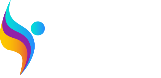
VISUAL IDENTITY
The visual identity of the Wings for All Program was meticulously designed to embody its three core pillars:
- Inclusion of women (represented by purple)
- Diversity (symbolized by blue)
- Training (expressed by orange)


These colors were thoughtfully selected to harmonize, merging into a symbolic depiction of a human figure with open wings, poised for flight. This unique representation encapsulates all facets and objectives of the program.
The incorporation of curved lines in the logo and background conveys a sense of fluidity and dynamism.
During the creation process, visual accessibility was prioritized, with specific tests conducted to ensure the brand is easily understood and recognized by individuals with color blindness.